


Designed by macrovector / Freepik"
I see most articles/blogs etc write such positive words on colour choices and how one must follow this rule, or that, for the perfect colour selection. That is all fine if you would like to follow these examples, but not for me. This is just my views on colour selection.
Just who is this Pantone and why do they think they know all?
Well from my simple understanding they are the colour guru’s of the world. Companies come to them for their predictions and forecasts in global colour trends. Each year they decide/predict a colour and we are meant to rush out and swap all our worldly possessions to this colour. Sounds like a great marketing ploy for some!
I do personally think this is not really a thing. I most certainly will not be changing my taste in colours just because they say a colour is the ‘thing’ for that year! And if they really think I am going to make a point of designing in the colour green as that is the ‘it’ thing for that year, well everyone had best not place a bet on that one!
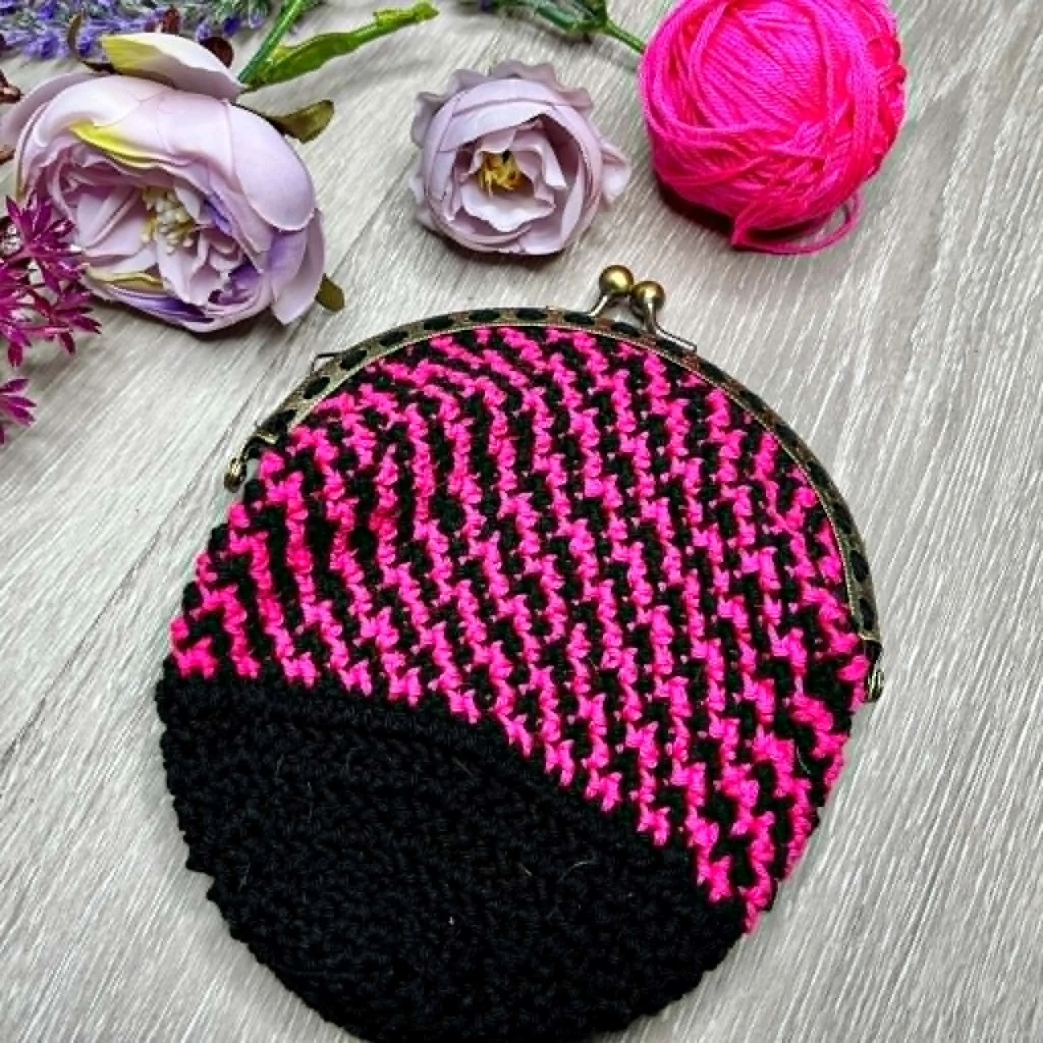
Sometimes of course they do get it right and this year I will bow to their intelligence with the choice of the colour Very Peri, which is basically the colour purple.

What they had to say:
2022
Very Peri is a dynamic periwinkle blue hue with a vivifying violet red undertone. Futuristic in feeling and encouraging inventiveness and creativity, Very Peri blends the faithfulness and constancy of blue with the energy and excitement of red. A brand new shade, it's the first time Pantone has created a new colour in the history of its Colour of the Year forecasts.
Well if it is vivifying then of course I am on-board with it. One just has to be really!

*I have a pattern in testing right now which features this colour. The pattern will be released early next year. Possibly as a CAL!
But let’s have a look at a few other choices from not so long ago!
2021
Illuminating and Ultimate Gray
Illuminating is a bright and cheerful yellow sparkling with vivacity; a warming yellow shade imbued with solar power.
Ultimate Grey quietly assures, encouraging feelings of composure, steadiness and resilience. The versatile grey shade resembles pebbles on the beach and natural elements whose weathered appearance highlights an ability to stand the test of time.
They were a little undecided in 2021, or maybe they had a fight over which colour should be the thing, as they had two colours. How could one not feel the need to purchase yellow and gray!

I could do with some illuminating and a bit of quiet assurance!
2020
Classic Blue
An expansive presence, Classic Blue is evocative of the vast and infinite evening sky opening a world of possibilities.
I don’t mind a nice blue and especially love cars in the colour blue. I do, at times choose to design in blue and in fact have a design on the hook right now in this colour. The fact that it was colour of the year in 2020 did not really help me make that decision.

2019
Living Coral
Living Coral is an animating and life-affirming coral hue with a golden undertone that energises and enlivens with a softer edge.
Certainly sounds pretty good doesn’t it! I can live with the colour Living Coral, but lets just say its orange and be done with it. I do like a nice orange!
2018
Ultra Violet

A dramatically provocative and thoughtful purple shade, Ultra Violet communicates originality, ingenuity, and visionary thinking that points us towards the future.
Any year that is dubbed to be purple is a good year as far as I am concerned, so of course they will get a huge thumbs up from me on that one! I will even swoon dramatically and maybe a bit provocatively if needed.
2017
Greenery
A refreshing and revitalising shade, Greenery is symbolic of new beginnings.

Really! Are they mad!
This in my humble (yeah sure) opinion was a bad year. Greenery, Yuck! Yes, all year I had to fight the urge to rush out the door and buy everything and anything in Green. Sure!
But how do you decide what colours to use when you are wanting to start a new crochet project?
There are so many webpages that cater to helping others select colours. They tell you how to successfully use a colour wheel to select your colours.
Tips on how the colours such as: black will diminish other colours and white will set them apart as a feature. I guess this method can work for some, but you would never find me bothering with them. I find black can be a great tool to make other colours the star of the show.
And as for asking others to help such as friends or LYS staff………well that is great if you happen to want a creation in the colours that they like, but I want something I would like.
Colour charts have their place but I am not really going to use them. But if they are for you, then all good.
Colour is personal!
Colour is a very personal thing to each of us and I gravitate towards purples and oranges. Dislike green and red with a passion, don’t mind pinks and am agnostic towards many other colours. And that is okay! My motto is that you should be you and choose what you like and I will continue to be me!
Colour perception is emotive!
Colours have a way of drawing a person in. They can evoke emotions on a wide spectrum and this is very individual for all.
Colour is in the eye of the beholder!
Ask any crochet designer and they will tell you that a design can transform and change visually, with each and every colour selection. What I may like and think is perfect, others may hate. If a colour brings you joy, then that is for you.
Some tips to selecting colours:


Look at natures Kaleidoscope of colour. It changes depending upon region and weather. You just have to look at a snowy landscape with a few bare spots, or maybe a snow covered tree. These can be your colour palette.
Or perhaps an Autumn day with the beauty of the trees in varying colours. The reds of a Japanese maple or the yellow of a Liquid Amber tree.
The ocean on a stormy day can have an array of colours.
Or a rainbow after a shower
Use the colours of flowers. Flowers are clever and they always get colour combinations right. When you think of a garden with a multitude of flowers, the colours always mix and match so beautifully together. And I will even admit (although don’t quote me on this) that green has it’s place in many of these scenarios!
Art work can also be an inspiration and show you what colours will compliment each other.
Life in general is full of colour and inspiration can be found in even the strangest places!


See what yarns call to you:


Place yarns together and see how they make YOU feel. No one elses opinion really matters (unless you happen to be making the project for someone else). I know the Scheepjes whirl are often yelling my name when I enter a LYS. The purples are usually the loudest!
You may want to feel bold with colours that hit you in the face or subdued with neutral colours. Or even monochrome with simple black and white.
Decide what emotions or feelings you may want to create from your design/project piece:
Colours can be calming or exciting and there are so many different articles on what emotions each colour is meant to illicit but it does depend upon what you read. They can vary. Take yellow for example. Depending upon what you choose to read or believe yellow can portray, happiness, sunshine, jealousy, cowardice, sickness, mental illness, warmth, hope, youth or even freshness. That certainly is a selection! I could mention the varying meanings of so many colours but if you want that information, there are a million places at your fingertips that will tell you what a colour is meant to make you feel.
I say to use your own thoughts on this one and go by what the colours make YOU feel.
But most of all be brave in your choices and selections. It is your project and colour selection is an extension of you!
But if you do want GREEN, GREEN, GREEN then maybe for me you had best just keep moving along! Just joking!
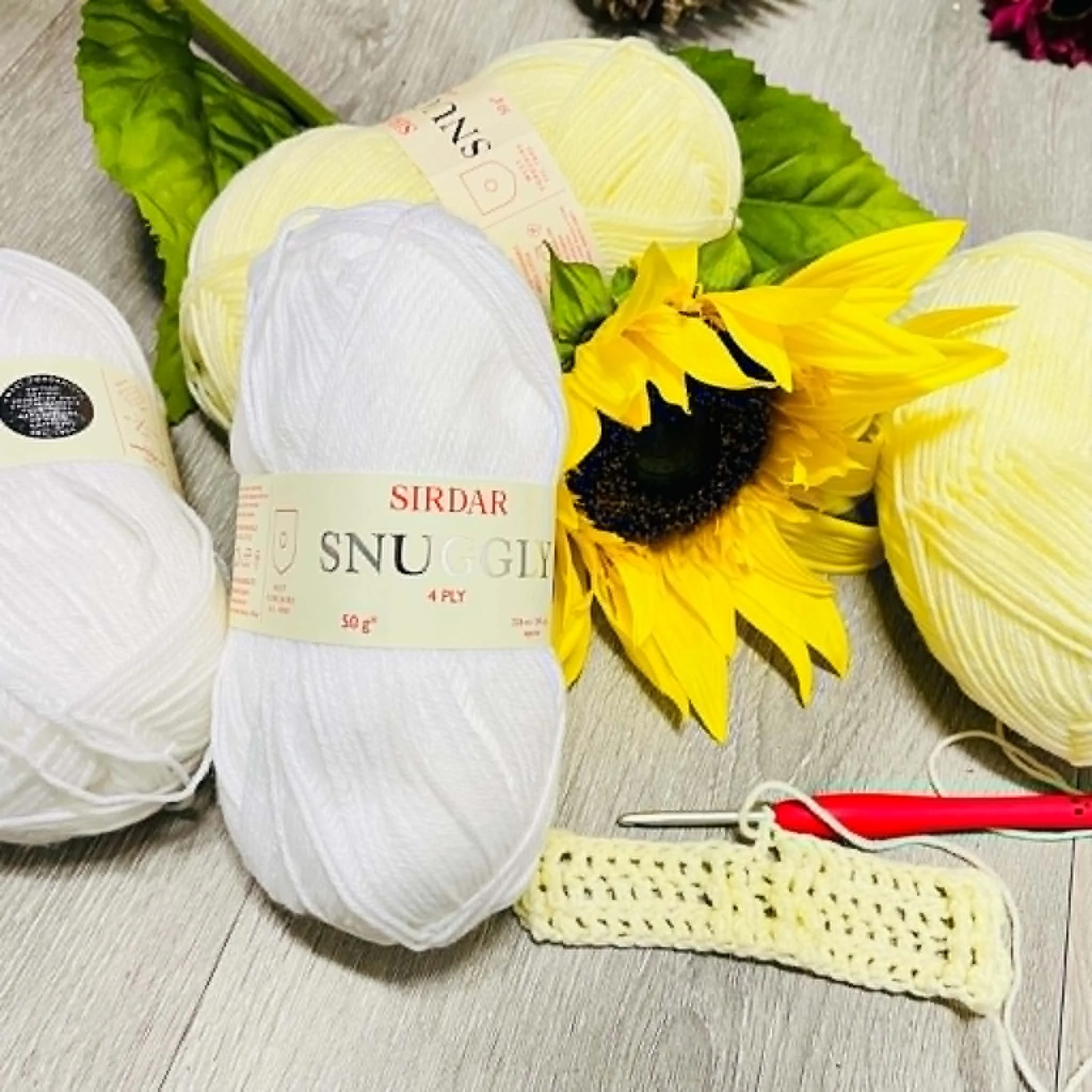
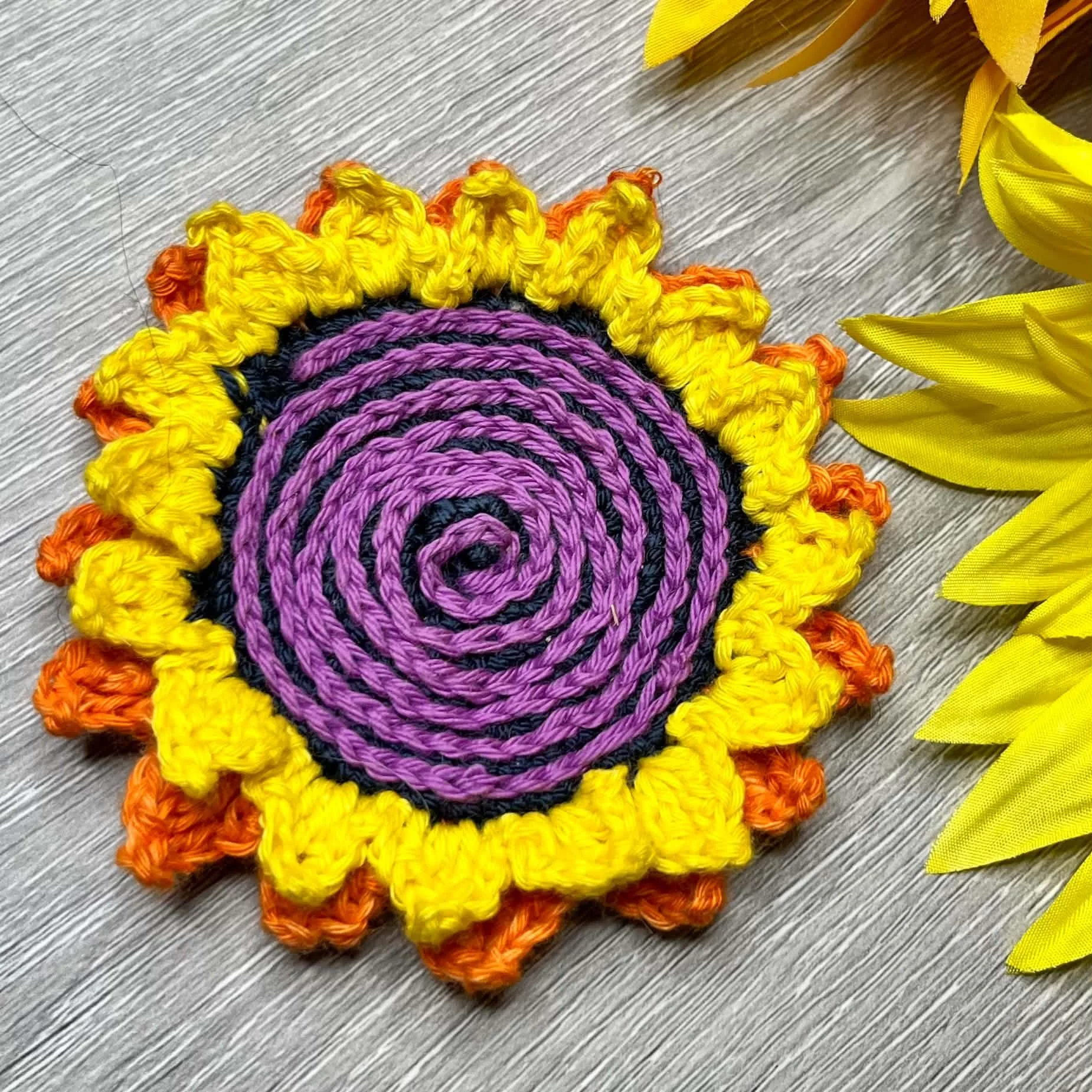
Links to the patterns in the pictures:
Bouquet for Bethany Blanket (without the embroidery) (click here)
Tirari Desert Flower Ruana (click here)
You can find all the information about the yarns used etc on the designs featured via the links above.
I hope you enjoyed reading my take on Pantone colours!
