


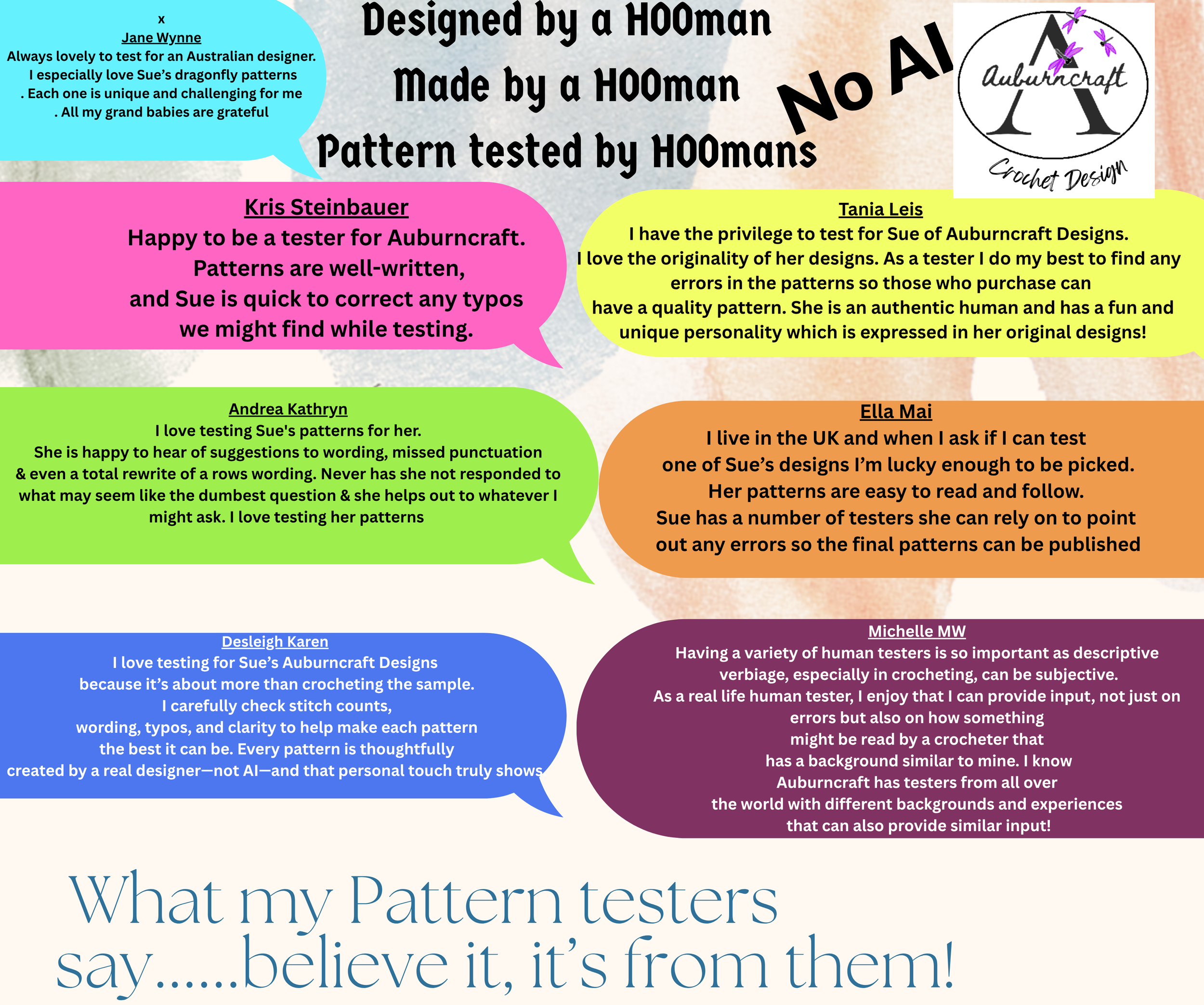


Do you ever find yourself longing to step back in time?
Because honestly, I’m feeling an almost gravitational pull dragging me back to 2023. The Pantone Colour Institute — in all their infinite wisdom — has me diving head-first into my time capsule and hurtling down the Time Tunnel straight to the glorious days of Viva Magenta (PANTONE 18-1750).
Ah yes. 2023. A very good year. But let’s be real: any year dipped in a shade of purple is automatically superior. It’s scientific.
And then… we arrive at 2026.
Pantone steps forward and triumphantly announces PANTONE 11-4201 Cloud Dancer — an off white so off it makes you wonder if the colour-picking committee spent their afternoon locked in a padded room and thought, “Hey, this looks familiar.”
I can already see people begging for colour — any colour (okay, maybe not green). Honestly, it would take one rebellious flick of a brush dipped in purple, orange, pink, or yellow to “accidentally” fall into the tin of off white. Just a tiny sabotage. For the greater good.

Picture the big Pantone board meeting:
“Alright team, 2026. What sums up the mood?”
A chorus of architects and interior designers replies,
“I know! Let’s go with a noiiiiice off white. It’ll be fab-u-lous.”
Of course it will. Everything white is fabulous, darling.
But wait — the meaning of off white:
Purity. Innocence. Cleanliness.
Also… death and sadness.
Perfect. A colour for every occasion.
White makes spaces feel bigger, they claim.
Maybe that’s the grand plan for 2026: make the year look large and airy so no one notices how truly rotten 2025 has been. Clever.
“Let’s call it Cloud Dancer,” they say.
Because clouds are famously known for their structure and reliability.
So here we are, marching boldly (or reluctantly) toward 2026 with an off-white energy — a blank canvas for literally anything more interesting to land on it.
Bring on 2027 — and please, Pantone, anything but greeeeennnnnnnn. Well maybe not ANYTHING!